The Importance of Color in Space Organization: How Minimalist Choices Can Create Harmonious Environments
Understanding Color in Space Design
Color is much more than an aesthetic choice; it is a crucial element that can significantly affect the dynamics of both personal and professional spaces. In Nigeria, where rich cultural heritage and modern design intersect, the use of color can transform environments in ways that extend beyond mere decoration.
One of the key aspects is the emotional influence of color. Various studies have shown that colors trigger specific emotions and reactions. For instance, blue tends to promote feelings of tranquility and calmness, making it popular for bedrooms and spaces meant for relaxation. In contrast, vibrant colors like red and orange can inject energy and enthusiasm into a room, making them suitable for social spaces like living rooms or cafes. In Nigeria, where social gatherings are a cultural norm, choosing lively colors can amplify the vibrancy of a space, encouraging interaction and warmth among guests.
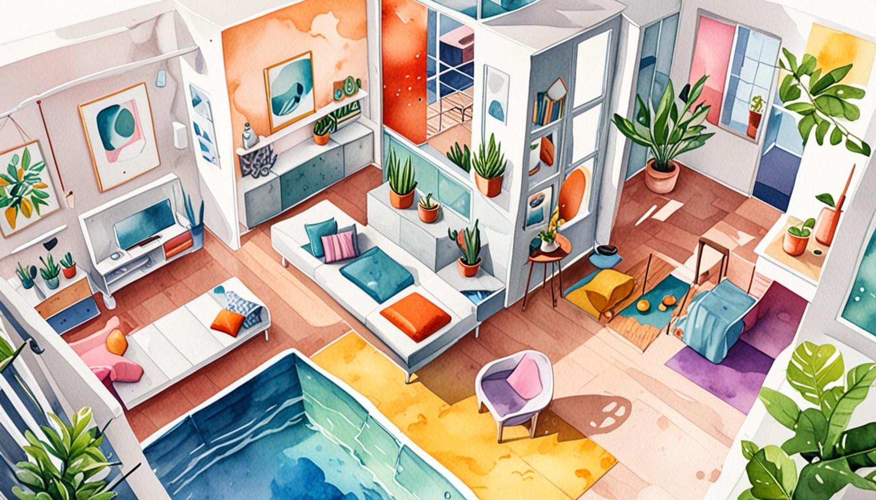
Additionally, the perception of space is heavily influenced by color choices. Light and neutral colors can visually expand a room, making it feel more spacious, which is particularly beneficial in urban Nigerian apartments where space can be limited. Conversely, dark hues can create an intimate atmosphere, perfect for creating cozy reading nooks or intimate dining areas. A great example can be seen in some of Lagos’ upscale restaurants, where designers often utilize darker palettes to foster an intimate dining experience.
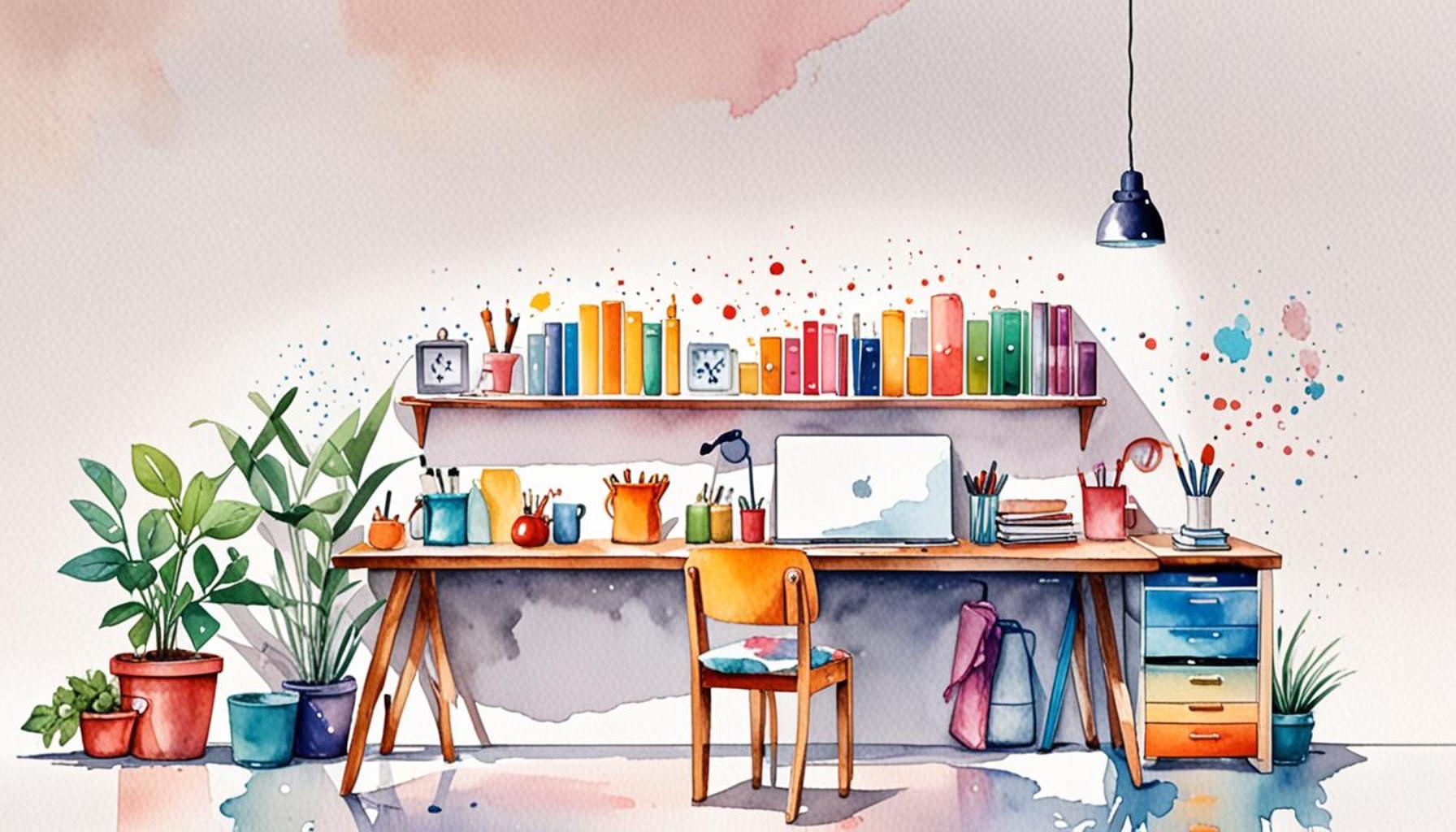
Moreover, the importance of achieving harmonious interiors cannot be overstated. A carefully curated color palette can seamlessly enhance the flow between different areas of a home or office, creating a cohesive look that feels intentional and inviting. The minimalist design approach, which is becoming increasingly popular in Nigeria’s urban settings, emphasizes the absence of clutter and distraction, allowing the selected colors to stand out and contribute to a sense of unity. Homeowners may choose a palette of soft earth tones or monochromatic shades, which not only simplifies design decisions but also enhances the visual and emotional appeal of the space.
Research indicates that the physical environment significantly impacts productivity and stress levels. A well-organized and color-considered space can lead to increased focus and reduced anxiety, particularly in work environments. For example, tech startups in Nigeria are now embracing vibrant yet calming color schemes to enhance creativity among employees, fostering an atmosphere that promotes both innovation and comfort.
This exploration of the relationship between color and the organization of space ultimately serves as a guide for individuals looking to implement minimalist aesthetics for a more cohesive and welcoming atmosphere. By understanding and leveraging the powerful role of color in design, one can create spaces that not only look appealing but also evoke the right moods and facilitate better interactions.
LEARN MORE: This related article may interest you
The Psychological Impact of Color Choices
The psychological effects of colors are profound and often go unnoticed in daily life. When it comes to organizing spaces, understanding how color can shape our emotions and perceptions is essential. Various hues can evoke feelings that influence our behavior and interactions, making the right selection pivotal in creating desirable atmospheres.
For example, the color green is frequently associated with nature and revitalization. In urban Nigerian settings, where hustle and bustle dominate the landscape, incorporating green tones—through plants or wall colors—can serve as a soothing antidote, promoting relaxation and a sense of tranquility. This is especially vital in workspace designs where stress levels may run high, as a touch of green can remarkably enhance employee well-being and productivity.
Conversely, yellow is known for its uplifting qualities, often seen in playful design schemes. In environments like children’s learning spaces or creative studios, yellow can spark enthusiasm and ignite creativity. Nigerian schools are increasingly adopting bright and bold color palettes in their classrooms to foster an exciting learning atmosphere, demonstrating the power of color in educational settings.
Another vital aspect of color psychology is its association with cultural significance. In Nigeria, colors carry deep meanings; for instance:
- Red symbolizes strength and passion, often used in traditional ceremonies.
- Blue represents peace, often incorporated into communal spaces to encourage harmony.
- White signifies purity and is commonly used in spiritual settings.
Understanding these cultural nuances can further inform the color strategy employed in both personal and shared spaces, ensuring that designs resonate well with their intended audience. Furthermore, in adopting a minimalist approach, individuals can focus on a limited color palette that reflects these cultural symbols, thereby promoting a more harmonious environment while eliminating distractions that clutter the mind and space.
A minimalist aesthetic enables individuals to select fewer colors, allowing each to shine and contribute to a cohesive environment. This deliberate choice emphasizes quality over quantity, fostering a space that feels intentional and thoughtful. For interior designers in Nigeria, this approach often translates into well-curated rooms that celebrate the essence of local artistry, culture, and modernity.
The interplay between color, space organization, and emotional response is not just a theoretical concept; it influences everyday living. By consciously selecting colors that align with desired emotions and cultural significance, individuals can create spaces that uplift, promote well-being, and stimulate positive interactions. As the relationship between color and organization continues to be explored, its implications for creating nurturing, minimalist environments are becoming increasingly clear and impactful.
One of the most impactful elements of design is the use of color. In minimalist spaces, color plays a critical role in establishing a sense of balance and harmony. When strategically chosen, colors can evoke emotions, influence behaviors, and even alter perceptions of space, making it crucial to consider their implications in space organization.For instance, a well-known psychological principle is that colors can affect mood and energy levels. Subtle hues, like soft blues and greens, are often associated with tranquility and peace, making them ideal choices for environments such as healthcare facilities or meditation rooms. Conversely, bright colors, like vibrant yellows or reds, can stimulate creativity and energy, which might be beneficial in workspaces or creative studios. Understanding these color associations allows individuals to intentionally craft environments that align with the desired atmosphere.Additionally, in the realm of minimalist design, the careful use of color can highlight the beauty of simplicity. A monochromatic color scheme, with varying shades of a single hue, can create a sophisticated look while keeping distractions to a minimum. This approach not only emphasizes the clean lines and spaciousness often associated with minimalism but also provides visual comfort.It’s also essential to recognize the role of contrast in color choices. Using contrasting hues in a thoughtful manner can draw attention to specific areas or features within a space, guiding the viewer’s eye and enhancing the overall aesthetic. For example, a crisp white wall adorned with a singular piece of dark-colored artwork can create a focal point that enriches the environment while maintaining a minimalist ethos.In practice, integrating color into minimalist design also involves considering the materials used in the space. Natural materials such as wood, stone, or textiles can complement chosen colors, adding depth and texture without overwhelming the simplicity of the design. Sustainable choices in materials further enhance the harmony of the environment, aligning with the minimalist principle of consciously selecting what occupies a space.In summary, the importance of color in space organization cannot be overstated. By choosing colors mindfully and understanding their emotional and psychological impacts, individuals can create environments that are not only harmonious but also enriching. Whether through soft, serene palettes or bold, energizing hues, the right color choices can elevate any minimalist space, making it a functional and inviting sanctuary.
YOU MAY ALSO LIKE: Read read another article
The Role of Color in Functional Space Design
In the realm of space organization, color selection not only carries psychological implications but also serves functional purposes that enhance usability and accessibility. In Nigerian urban centers where space is often limited, understanding how color influences spatial perception can help individuals maximize the functionality of their environments. For instance, lighter colors like white and pastel shades tend to make spaces feel larger and more open, which is a crucial consideration in compact apartments or small offices. When combined with a minimalist approach, these colors can create uncluttered and breathable spaces where inhabitants feel less constrained.
Conversely, darker hues can create a sense of warmth and coziness in larger areas, turning vast expanses into inviting environments. For instance, a deep blue or rich brown can anchor a spacious living room, enhancing its comforting feel while simultaneously delineating the boundaries of the space. This strategic use of color not only enhances aesthetic appeal but also helps establish distinct areas within a large room, making it easier to navigate and utilize.
Moreover, in commercial environments such as cafes or co-working spaces, the right color can significantly affect customer experience and behavior. Researchers have found that warm colors, such as reds and oranges, can stimulate appetite and foster social interaction, making them ideal choices for eateries aiming to create a bustling atmosphere. In contrast, cooler shades like blue or green can be used in productivity-focused settings to instill calmness and concentration, ultimately driving success in environments where focus is paramount.
- Case Studies — Some Nigerian businesses have successfully adopted color strategies to enhance their environments. Restaurants in Lagos utilizing vibrant tones such as yellow and orange have seen an increase in customer retention due to the appealing ambiance created.
- Commercial Settings — Co-working spaces that incorporate calming greens and blues are finding success in attracting professionals looking for an inspiring yet tranquil setting to foster productivity.
The importance of color is even evident in practical applications beyond aesthetics. For example, using a uniform color scheme for storage bins can increase organization efficiency and reduce stress associated with clutter. In Nigeria, where mixed-use environments are common, organizing spaces by color can help coordinate numerous activities, from storage to display areas in markets or shops, enhancing navigation for both owners and customers.
Furthermore, these color choices can lead to a more sustainable approach to space organization. Embracing muted and natural tones often means fewer artificial materials and paints, aligning with eco-friendly practices that are gaining traction in Nigeria. Minimalism, combined with thoughtful color use, can inspire a lifestyle that values simplicity and sustainability, contrasting starkly with the vibrant chaos of city life.
Ultimately, artists, designers, and homeowners alike can tap into the transformative power of color in crafting thoughtful, functional environments. By prioritizing minimalist principles, individuals can curate spaces that are not just visually appealing but also resonate with psychological comfort and practical usability, redefining how spaces are experienced.
CHECK OUT: Click here to explore more
Conclusion: Embracing Color for Enhanced Space Organization
In summary, the strategic use of color in space organization extends well beyond mere aesthetic appeal; it serves as a powerful tool in crafting environments that are both functional and harmonious. As highlighted, the impact of color selection influences not only the perception of space but also contributes to emotional well-being and productivity. In Nigeria’s bustling urban landscape, where every square meter counts, leveraging minimalist color choices can significantly enhance the usability of limited spaces, allowing inhabitants to live and work efficiently.
Moreover, by understanding the psychological effects of different colors, designers and homeowners can create designated areas that foster intended activities—whether that be relaxation, collaboration, or focus. Blending design principles with a thoughtful approach to color can turn ordinary environments into vibrant, welcoming spaces that launch a wave of productivity and comfort. As seen in successful case studies, businesses that incorporate carefully chosen color palettes witness improved customer engagement and satisfaction, proving that the right hues can elevate experiences.
Additionally, a commitment to sustainability through the use of eco-friendly colors promotes a growth mindset that resonates with a more conscious lifestyle. As Nigerians increasingly value simplicity and environmental awareness, adopting minimalist principles can inspire a shift away from cluttered spaces, making room for tranquility amidst the chaos of city living.
Ultimately, understanding the importance of color in space organization equips us with the tools to craft not only beautiful but also meaningful environments. As you explore the potential of color in your personal or professional spaces, consider the profound alterations that thoughtful choices can bring to enhancing our interactions with the world around us.